ChatGPT is a product containing other products
At first, ChatGPT looks like a single product. Start using it, and you'll see that it's a product containing other products. I use it regularly and sometimes find it confusing.
In this study, you can interact with the components and compare them with how they look today. The screenshots were taken on September 20th, 2026. Each component is focused on one problem.
ChatGPT has more issues than what's covered here. I covered only what I find most confusing or annoying.
One composer and 3 modes
On the web there is a switch at the top, Chat and Work. On desktop, there's also Codex, but it's placed in a dropdown in the sidebar, as a selection between ChatGPT and Codex.
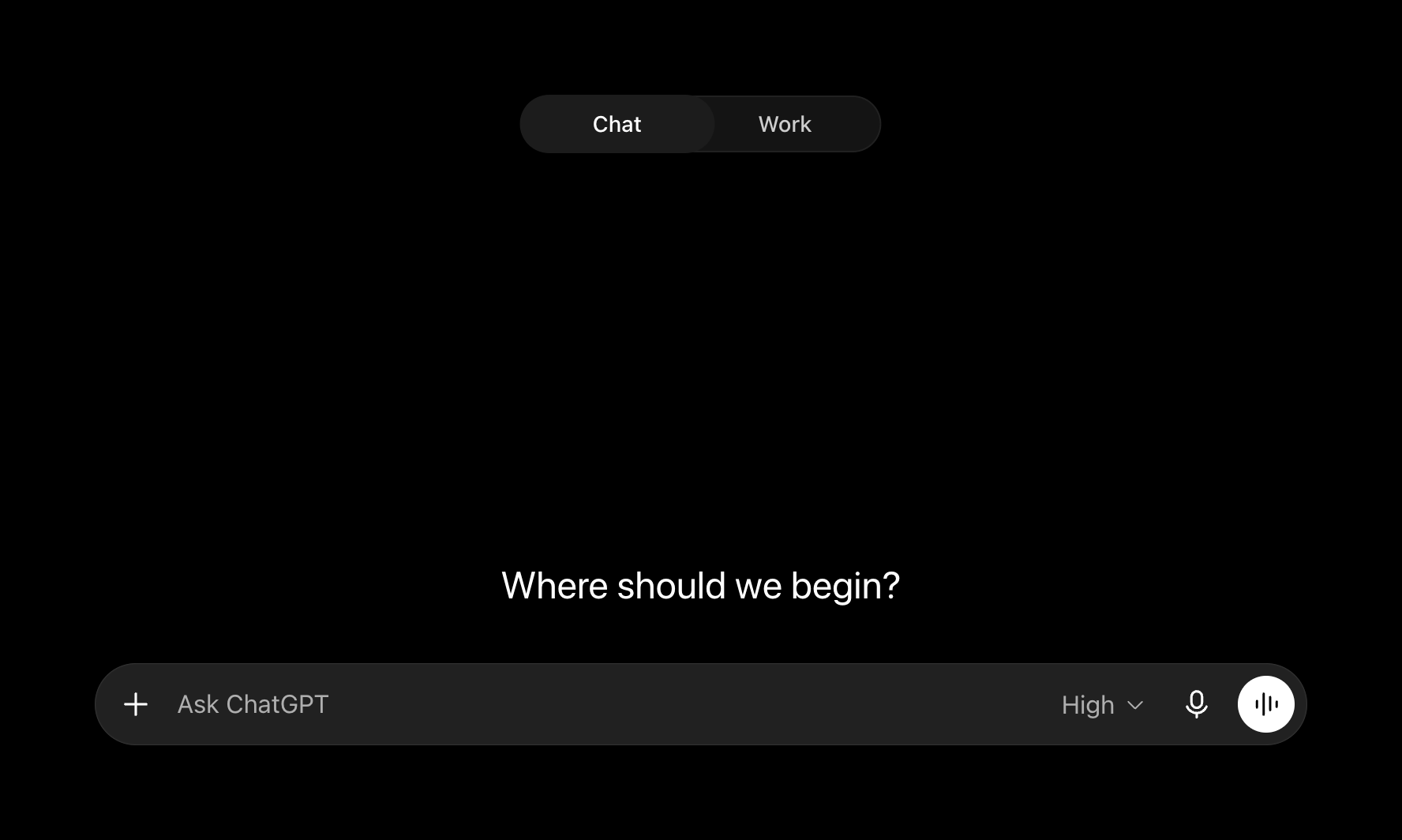
Each mode has its own composer and UI elements. While this makes sense when you know what you want, you might "slip" and be in the wrong mode.
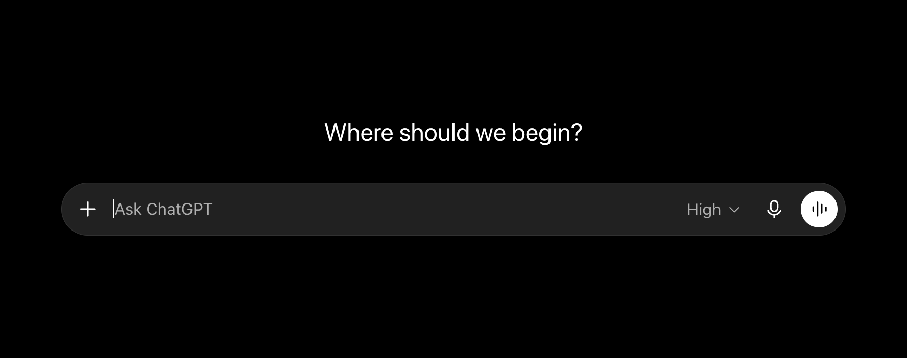
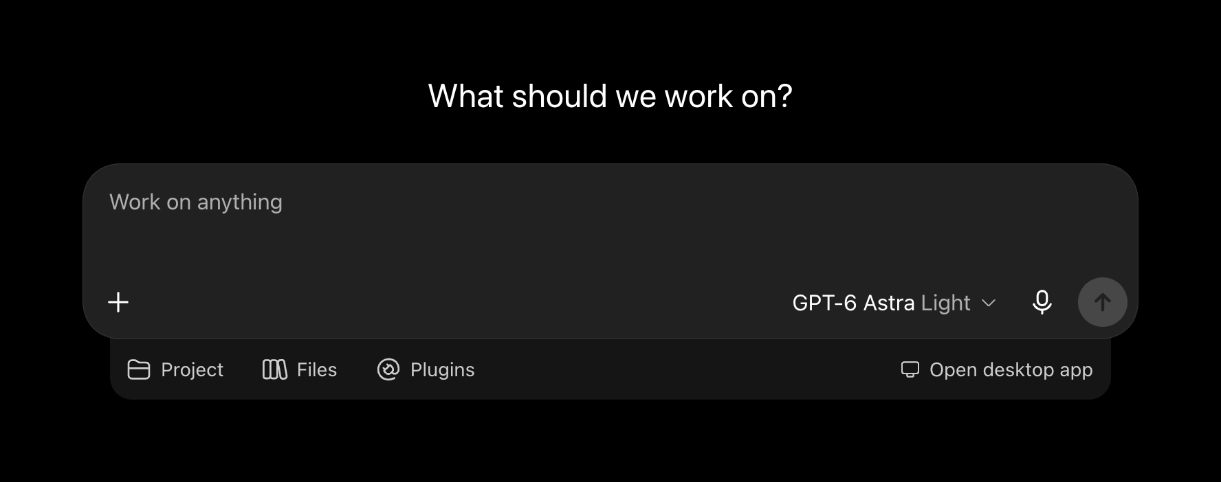
This happens to me often between Codex and Work, and less with Chat. For example, if I need a terminal, I have to switch from Work or Chat to Codex.
That's why I merged the modes into one composer, which adapts to your context. A repo? Show branch. Working with files? Show plugins / files. Chat? Just keep chatting.
Where should we begin?
Answers in chat. @ for context, / for skills.
My first idea was to add Codex as a 3rd mode. It didn't work. The difference between Work and Codex isn't substantial enough, and a 3rd mode adds clutter and makes the choice harder, especially if you don't know that Codex stands for coding tasks.
Next, I tried to fold Work into Codex. I renamed Work to Codex and made the context adaptive. People who don't know what Codex does won't know what it's for. Work's users will be confused to see Codex as a new name for it, because they got used to Work, which is straightforward.
Instead, I tried to move Codex into what was Work, and Work into Chat. This merge was clearer, but now people who were using Chat for its simplicity are confused by all the context, and there's still Codex on top. The composer's now nearly the same in both modes. This makes the choice harder for all 3 groups of people who knew what they were using each mode for.
The final decision was to make the composer itself shared and show relevant context depending on what you do. The segmented picker on top is now gone, and you can focus on your task. Is this solution perfect? No, because people will have to adjust.
Projects on desktop and web
The desktop app has projects as folders. In fact, one project can be several folders. Projects also exist on the web. To make it work well both on the web and on desktop, I tried reading the project from the prompt, tagging it with @, and showing recent projects. One issue with every option is speed.
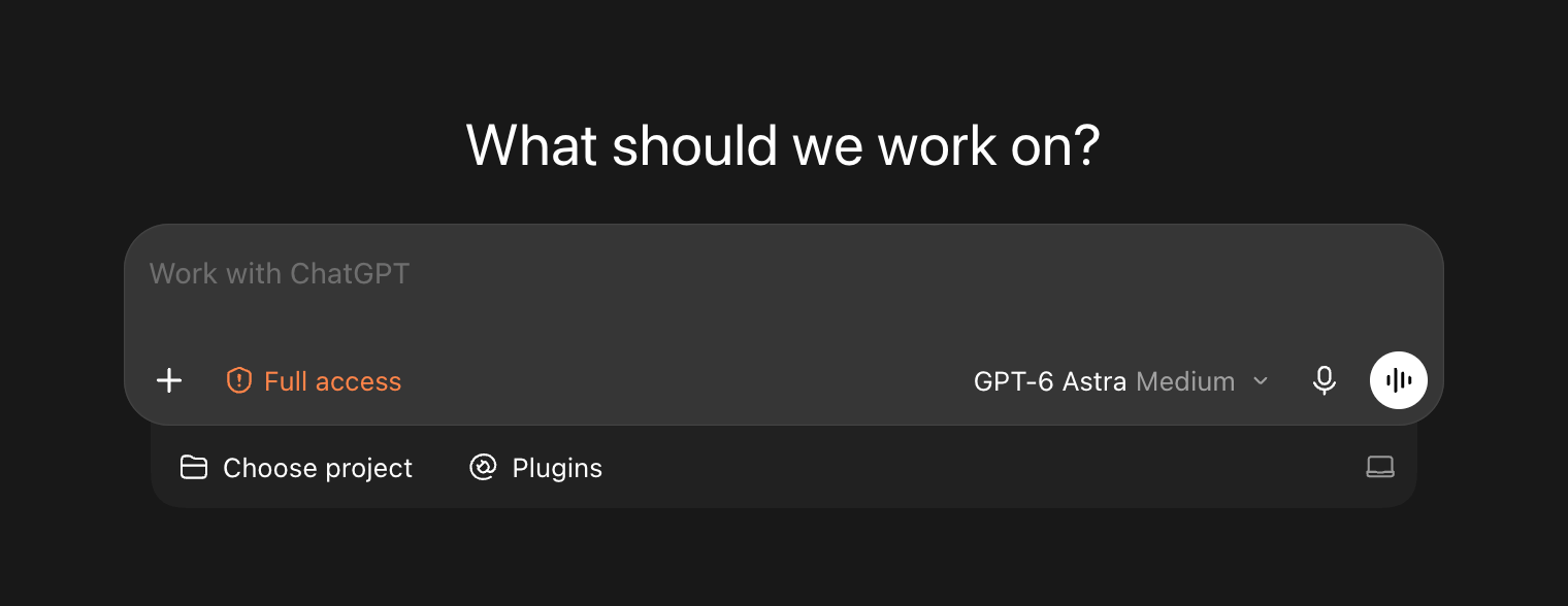
Reading from the prompt was the least straightforward option and it made project picking slower. Tagging works, but it's not a good option alone, because you might want to pick it faster or create a new one on the web. Having recent projects doesn't work well either. They're not a good option if you want to pick non-recent projects, and the space is limited. It's better to just have a project picker which will show you every project you have.
That's why I've decided on a combination of the explored ideas. It's a project picker, like now, plus @ if you prefer to type an existing project or a path to a new one.
Where should we begin?
Answers in chat. @ for context, / for skills.
Skills
Today, the skill won't appear as a skill on the web if you type it fully. More importantly, there's no skill picker.
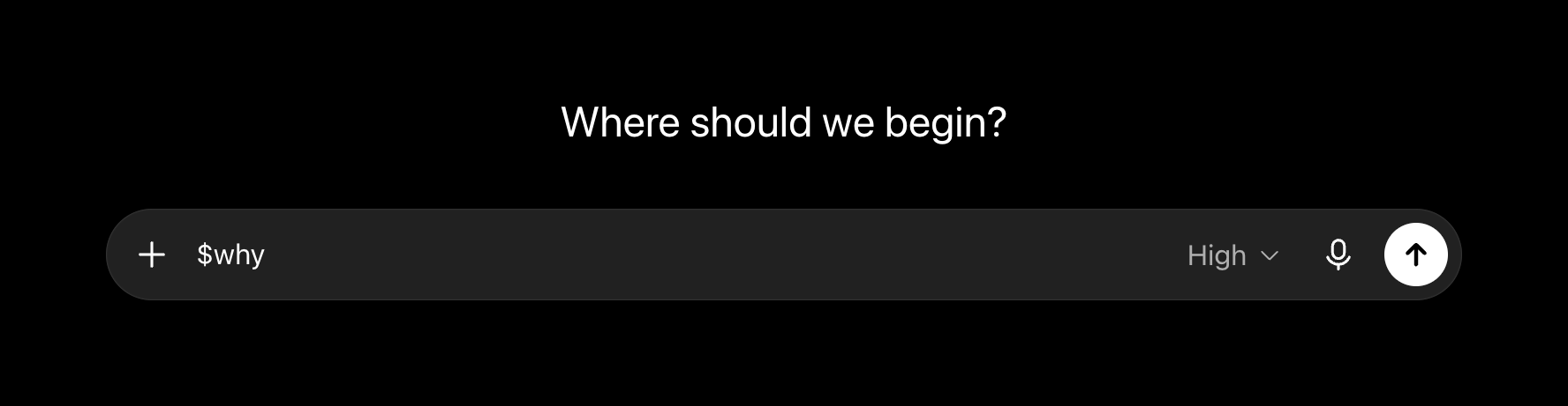
I added a skill picker for the web. I support both / and $, because that's how it's done in the desktop app.
The skills are supposed to be inline instead of attachments. That's how it's done in the desktop app and most other apps. This also saves space and tells skills apart from file attachments.
Where should we begin?
Answers in chat. @ for context, / for skills.
You can toggle between Today and Inline skills, and check the change yourself. Type / or $ and the list of skills will appear in the Inline skills option.
Sidebar
The sidebar offers a lot of items, and not everyone uses all of them. The desktop app handles this well by allowing users to hide these items. It's inconsistent with the web app, where you can't hide anything.
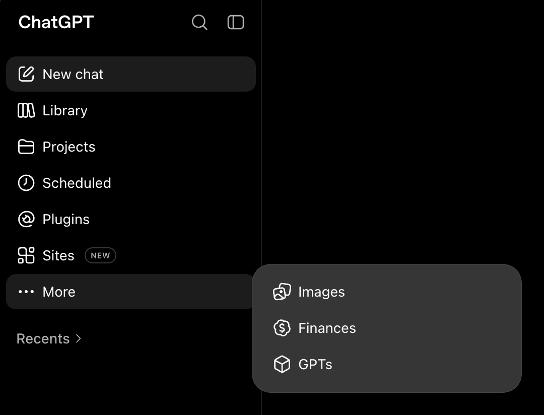
To make it consistent with the desktop app, I added an option to hide every item you don't use. Because New chat is used often and is essential for the app, you can't hide it. You can find hidden items in "More", and if you need them always displayed, you can toggle them back.
Edit mode is for toggling each item. You can find the edit button in the More section, since it's not a setting you'll want to see daily.
Where should we begin?
Answers in chat. @ for context, / for skills.
I liked both edit mode and hiding on the item, but edit mode is better. Edit mode allows toggling all the items, and hiding directly in the menu is slower if you want to do it with several items.
Settings
Settings are disorganized in the web app. The desktop app has them organized, but still worse than on mobile. To make it consistent, I picked the organization from mobile and applied it to the web.
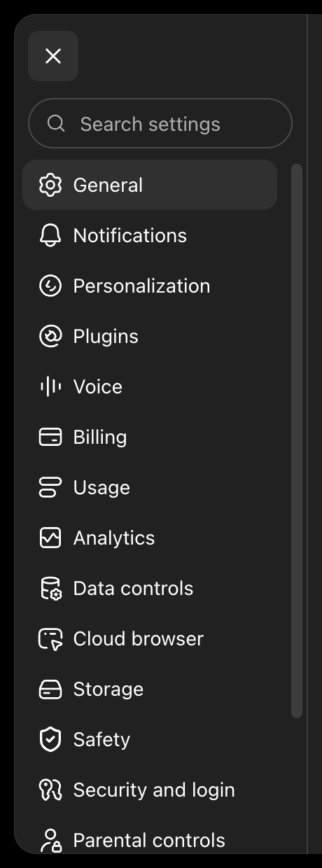
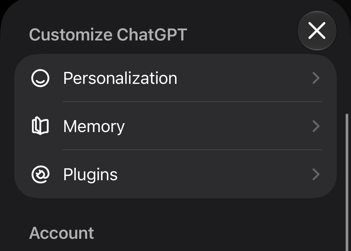
Because the web has more available space, I made the settings options appear on the left and the settings that belong to each option in a larger section on the right.
Where should we begin?
Answers in chat. @ for context, / for skills.
General
If I had settled on the cards from mobile, you'd spend more time scrolling, and navigating between sections would be slow. It might appear better aesthetically, but it's less usable.
For prototyping purposes, the settings are simpler and use placeholders.
Everything together
You can see how these changes come together.
Where should we begin?
Answers in chat. @ for context, / for skills.
ChatGPT has UI differences depending on your plan. My changes mostly cover what I see in the Pro plan. If I had the data that OpenAI has, I might've done it differently.